
Top Trends in Cannabis Packaging and Branding
We’ve come a long way from packaging cannabis in the ceramic jars and metal tins of nineteenth century apothecaries. As newly-legal markets bloom and mature ones become increasingly competitive, packaging must both preserve products and differentiate brands.
Stay in touch!
Join our email list to receive Calyx content & product updates.
By Nicole Erickson in Cannabis Packaging
Artisanal
Cannabis packaging of the nineteenth century might be obsolete, but we’ve got to admit it looked pretty cool. Some brands are leaning into this source of inspiration and producing vintage-inspired packaging designs full of warm, dark colors and natural textures. The artisanal style is used when brands want to communicate quality; maybe they cultivate and process in small batches or they’re targeting cannabis connoisseurs. Lowell Farms’ kraft outer packaging and intricate handmade illustrations echo the care that goes into their grow.
Many other California brands weave this style into their visual languages and pull inspiration from the golden state’s vineyards as they format regulatory information. Thin rules separate space into boxes housing the state-mandated warning symbol and individual products’ cannabinoid content. Lowell Farms, Zoma, and Woah Candy Co. all slice up their branding real estate this way.
We don’t think this style is going anywhere anytime soon, although you’ll see subtle shifts over time. New brands like Floro are using the artisan style as their packaging’s foundation although refreshing it with new colors and motifs.
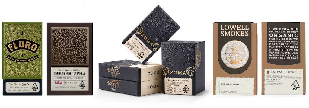
Photos courtesy of the Dieline, Woah Cannabis Co., and Lowell Herb Co.
Tight, symmetrical type lockups have become a packaging staple, and not just in California. You can expect designers to get more experimental before this trend runs its course. Canadian brand Greybeard Cannabis Co.’s vintage-inspired lockups might look like they belong outside an apothecary’s door at first glance, but subtle details, like thin rules and left italicized type, go a long way in bringing the design out of the 19th and into the 21st century.
Artisan-style brands don’t use graphics alone to signal product quality and craftsmanship. Choice of packaging is just as important, and Greybeard Cannabis Co. packs their extracts in Calyx’s premium German glass concentrate container. Other jars might come at a lower price point, but end up costing more down the line. Industry standard round jars’ limited gripping space and push down and turn mechanism make for a difficult opening experience that doesn't exactly signal thoughtful processing and packing. Consumers also have difficulty closing these jars correctly, resulting in product spoilage and oxidation. Quality cultivation and extraction should be matched by thoughtful packaging selection–otherwise, all that care might go to waste!
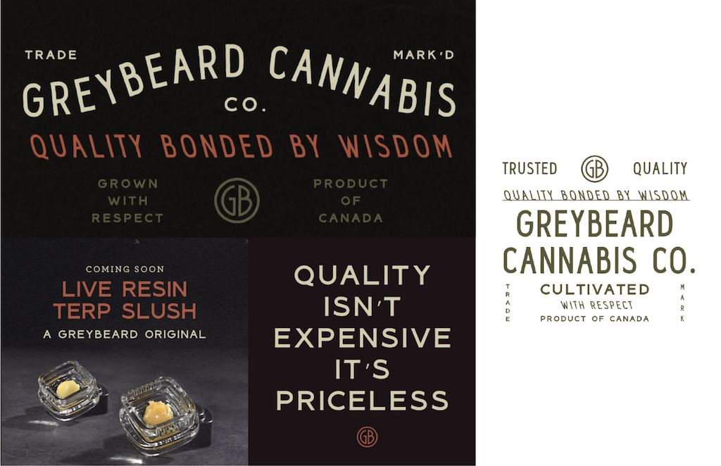
Photos courtesy of Greybeard Cannabis Co.
Old School Reimagined
Brands operating in the legal cannabis space are finding ways to reinterpret the tongue-in-cheek motifs of legacy market packaging design. You won’t see too many anthropomorphized buds, neon colors, or cartoon stoners anymore–most states prohibit the use of graphics that appeal to children or depict being high.
However, notable brands like Cookies, Packwoods, and Not Pot have found ways to stay true to the free-spirited irreverence of the cannabis community while bringing their packaging designs into a new era. Packwoods uses a dripping motif in its logo as well as its physical packaging, and Cookies is known for its playful, strain-specific illustrations. These graphics appeal to social consumers whose love of cannabis sharing culture means they want to bring the most flamboyant packaging designs to their smoke sesh. Old School cannabis packaging is still dank, faithfully shameless, and not in a hurry to abandon its roots for a polished look that would work just as well for skincare or cosmetics.
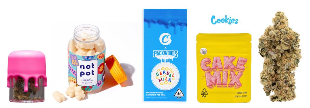
Photos courtesy of Packwoods, Not Pot, Packwoods, and Cookies.
Magnetic minimalism
You can count on these graphics to rebel against the tightly composed, utilitarian labels of pill bottles and pop-tops and on their packaging to prioritize user experience above all else. When appealing to benefits-focused and medically motivated customers, as opposed to social consumers, these brands use color and layout to communicate the specific attributes of their products. For edibles brand 1906, wide open space, oversized lettering, and evocative hues convey the purity of a single experience. Whether that experience is chill or energetic is entirely up to the consumer–they have the power to control their immediate reality.
Similarly, Wana Brands uses color and photorealistic food imagery to put customers in total control of flavor. Their straightforward and accessible design instills a sense of trust in the brand–consumers know exactly what each gummy will taste like and that the experience will be consistent every time. After all, consistent dosing and full-bodied flavor are what Wana does best. Without resealable, protective packaging, like the 25 Dram container, that experience would be in jeopardy.
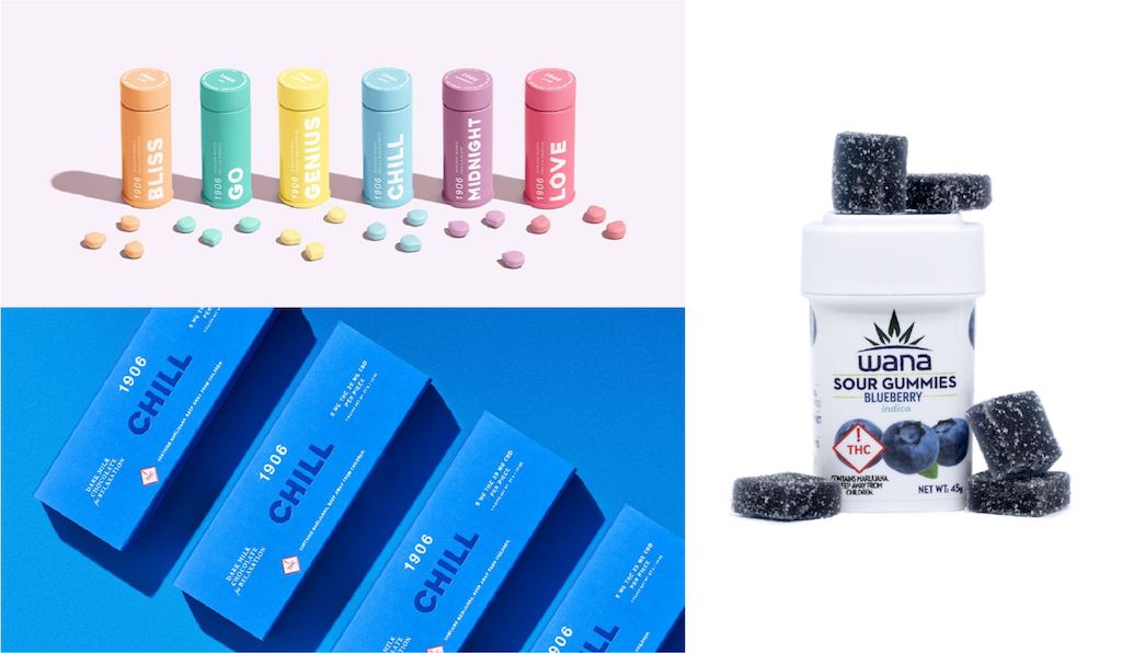
Photos courtesy of 1906 and Wana Brands.
Boojum Med uses the same streamlined, square packaging to appeal to consumers using cannabis as a medical or holistic remedy. Their customers may not be as interested in flamboyant graphics as those consuming cannabis socially, but aesthetics still influence their purchasing decisions. Boojum’s minimalist label is so successful because it walks the line between serious and exuberant, legitimate and alternative. Cool, bright colors and a thin gradient strip bring flair to their white packaging and structured, geometric logo mark. Because their product is intended for oral consumption and can be easily ingested by children, Boojum chose a container whose unique pinch and pull child-resistant closure keeps medicine both secure and accessible for those with limited dexterity.
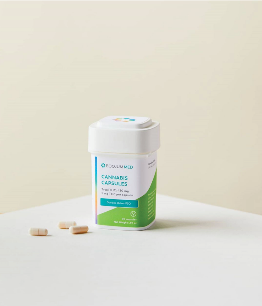
Image courtesy of Valerie Anselme, @anselmephotography
New 70s
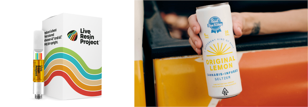
The 1970s have long been a rich source of inspiration for cannabis packaging. What’s not to love about warm color palettes paired with the funky shapes of the disco era? PBR recently launched an infused seltzer that made perfect use of 70s colors and motifs to create a feeling both casual and nostalgic. Their choice of a super-bold sans serif instead of a groovy typeface with curling swashes makes the look distinctly current. Live Resin Project’s rainbow stripes travel across the body of their packaging like skaters on a technicolor roller rink. Just like PBR, they opted for a bold, rounded typeface that roots their packaging design firmly in the present.
Sonder and Mother Liquor switched it up with bulbous, dramatic serif fonts that reference the disco era more directly. Sonder’s sunset-style lockup repeats a design framework on PBR’s can, but their packaging is completely original. Their otherworldly creations make use of bold color and psychedelic elements to bring 70s inspiration beyond the 2020s and into the next millennium. This LGBTQ+, woman-owned business has some of the most unique branding in the space. If 70s-inspired brands are to differentiate from leaders like Live Resin Project, they’ll need to push as hard as Sonder has to infuse the decade’s attitude and praxis into every aspect of their packaging.
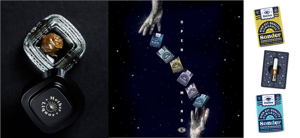
Photos courtesy of Mother Liquor and Sonder
Not a Trend: Sustainability
It’s no wonder the 70s have been so inspirational in cannabis branding. Psychedelic motifs may bring consumers a sense of comfort since they harken back to a time when we loudly called one another to return to the earth. The hippie movement’s loud, unabashed concern for our planet still resonates with industry insiders and consumers, many of whom view sustainable packaging as a requirement rather than a choice.
The need to protect our planet becomes more pressing every day, and caring for our Earth can no longer be a way to differentiate one brand or product from another. At its core, wasteful packaging is at odds with cannabis culture. Our community feels a sense of responsibility for the planet and we’re not shy about asking hard questions of our favorite brands. After all, they’ve got to appeal to us!
Wana’s partnership with Calyx Containers has put them at the forefront of reducing cannabis packaging waste. Wana eliminated multiple layers of packaging by adopting Calyx’s dram container, and at their scale this switch truly makes a difference in solving our industry’s waste problem.
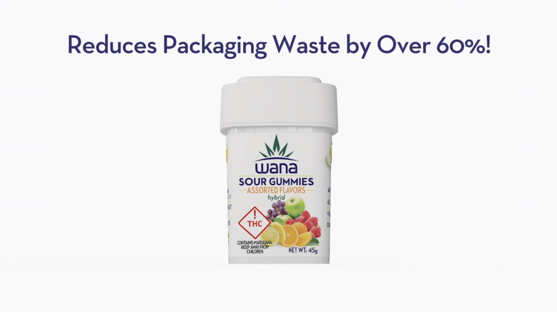
Photo courtesy of Wana Brands
How can you stay ahead of the curve?
All the information you need is already at your fingertips. Make time to analyze successful cannabis packaging and design–why is it so successful? How does it appeal to a brand’s target audience? Talk about good design with others. In the Design department at Calyx Containers, we hold monthly Good Design Showcases to analyze the most impressive creative work released across the globe. We also religiously check up on sites like The Dieline and agencies like Studio on Fire for innovations within and outside the cannabis space. The first step in knowing what’s to come is knowing what’s already out there!

Keep up to date on the latest in cannabis packaging.


